![[2021/12/22]국비지원 CSS3 4-(1) position](https://img1.daumcdn.net/thumb/R750x0/?scode=mtistory2&fname=https%3A%2F%2Fblog.kakaocdn.net%2Fdna%2FdG8OiX%2FbtrscPcsdcb%2FAAAAAAAAAAAAAAAAAAAAAFxr5y-NswZas35BfFOuN9jJ3tV2jkLYhjOE9ZmHO1Ev%2Fimg.png%3Fcredential%3DyqXZFxpELC7KVnFOS48ylbz2pIh7yKj8%26expires%3D1767193199%26allow_ip%3D%26allow_referer%3D%26signature%3DXf38jmlaQCzIgarJ2Zt%252FDwi%252BOYE%253D)
position : z 축 상으로 위치 잡기 ( 레이어 개념 ) / 일반적으로는 주변에 영향을 크게 주지 않음 ( fixed 제외 )
- position : relative = 밑에 깔리는 property, 상대 위치
상위 element나 기준이 될 element에 쓰임
position 비 지정된 일반 element을 밑에 깔고 그 위에 표시 가능 - position : fixed = 지정 위치에 고정시켜버리기 ( 화면 스크롤 중에도 그 위치에 고정된 상태로 출력됨 )
- position : absolute = 위에 덮는 property, 절대 위치
하위 element나 위에 올려서 같은 라인에 표현하고 싶은 element에 쓰임- offset : left, top, right, bottom
- z-index : 같은 property값으로 계속 덮을 경우 그중에서도 순위를 매기는 방법
숫자가 작을수록 밑에 깔리고 클수록 위에 덮임
z 축 기준
일반 element
relative
absolute
absolute z-index
fixed
요런 식
position: relative
<!DOCTYPE html>
<html lang="en">
<head>
    <meta charset="UTF-8">
    <meta http-equiv="X-UA-Compatible" content="IE=edge">
    <title>position:relative<title>
    <style type="text/css">
        h1{background:silver;color: #fff;}
        p{background:yellow;padding:10px;}
        .rel{position:relative;left:400px;top:100px;
            width:200px;height:100px;margin:0;background:aqua;}
        /* 상대위치(기준:자신), 레이어개념, 주변 영향 X
            OFFSET: Left, Top, Right, Bottom */
    </style>
</head>
<body>
    <h1 class="rel">Relative Position</h1>
    <p>
        relative position 박스 위치를 지정할 때 사용 할 수 있는 오프셋 속성으로는 top, left, right, bottom이 있다.
        박스의 본래 위치를 기준으로 배치된다.
    </p>
    <p>
        상대위치(relative position) 지정방식으로 박스가 배치될 경우 다른 블록 요소의 배치에 영향을 주지 않고 배치된다.
    </p>
</body>
</html>
결과물 ( relative로 일반 element p 덮어버리기 )

position: fixed
<!DOCTYPE html>
<html lang="en">
<head>
<meta charset="UTF-8">
<meta http-equiv="X-UA-Compatible" content="IE=edge">
<title>position:fixed<title>
<style type="text/css">
h1{background: silver;color:#fff;}
p{background:yellow;padding:10px;}
h2{height:2000px;}
.fix{position: fixed;left:0;top:0;
width:100%;height:50px;margin:0;background:aqua;}
/* position:fixed 특징 = 고정위치(스크린 기준)
레이어개념 본문 위에 위치, 주변에 영향 줌 */
</style>
</head>
<body>
<h1>Fixed Position</h1>
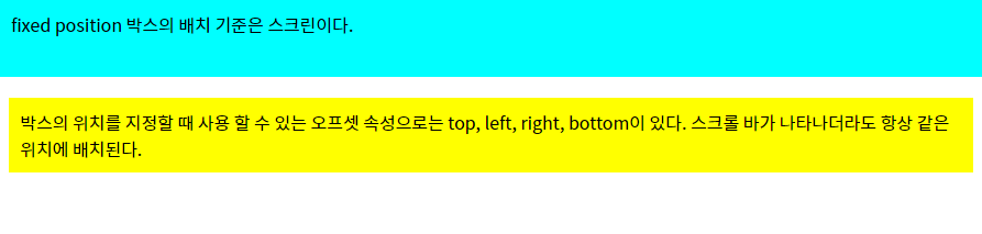
<p class="fix">fixed position 박스의 배치 기준은 스크린이다.</p>
<p>
박스의 위치를 지정할 때 사용 할 수 있는 오프셋 속성으로는 top, left, right, bottom이 있다.
스크롤 바가 나타나더라도 항상 같은 위치에 배치된다.
</p>
</body>
</html>
결과물 ( fixed로 일반 element h1 덮어버리기 )
position: absolute
<!DOCTYPE html>
<html lang="en">
<head>
    <meta charset="UTF-8">
    <meta http-equiv="X-UA-Compatible" content="IE=edge">
    <meta name="viewport" content="width=device-width, initial-scale=1.0">
    <title>position:absolute</title>
    <style type="text/css">
        *{margin: 0;padding: 0;}
        #outer{z-index:150;position:relative; width: 600px;border: 5px solid red;}
        .box{width: 100px;height: 100px;border: 5px solid #000;}
        #box1{z-index: 3;position: absolute;right:0;top:0;background: red;}
        #box2{z-index: 2;position: absolute;right: 50px;top: 50px;background: orange;}
        #box3{z-index: 1;position: absolute;right: 100px;top: 100px;background: yellow;}
        #side{z-index: 100; position:absolute; left:400px; top:50px;background: green;}
        /* position:absolute(절대위치), relative(상대위치),fixed(고정위치)
            offset 속성값: left, top, right, bottom
            레이어 순서바꿈: z-index, 큰 숫자가 맨 위로 옴 */
    </style>
</head>
<body>
    <div id="outer">
        <div class="box" id="box1">Box1</div>
        <div class="box" id="box2">Box2</div>
        <div class="box" id="box3">Box3</div>
    </div>
    <div class="box" id="side">side Box</div>
</body>
</html>
결과물
