![[2021/12/29]국비지원 CSS3 9-(3) 과제1 + 버튼](https://img1.daumcdn.net/thumb/R750x0/?scode=mtistory2&fname=https%3A%2F%2Fblog.kakaocdn.net%2Fdna%2Fb5VqdZ%2FbtrsfSmLTfL%2FAAAAAAAAAAAAAAAAAAAAAN938C_izImcgAUV4WqL9ZhUKoC1VuBwZayhaS8zgcfA%2Fimg.gif%3Fcredential%3DyqXZFxpELC7KVnFOS48ylbz2pIh7yKj8%26expires%3D1767193199%26allow_ip%3D%26allow_referer%3D%26signature%3DoNyJF940v8YBPhnFVYc5qVu9tJA%253D)
과제1
형태 : a로 만든 메뉴 항목
주제 : linear-gradient, rgba
동작 활용 psuedo-class = :hover, :active
작업내용
<!DOCTYPE html>
<html lang="en">
<head>
    <meta charset="UTF-8">
    <meta http-equiv="X-UA-Compatible" content="IE=edge">
    <meta name="viewport" content="width=device-width, initial-scale=1.0">
    <title>신승윤_메뉴예제1</title>
    <style type="text/css">
        ul{list-style: none;}
        li{float:left; margin:10px;font-size:15px;font-family:Arial, Helvetica, sans-serif;}
        a{padding:10px 30px;display:inline-block;text-decoration: none;color: #fff;text-shadow: 0px 1px 1px rgba(0,0,0,0.3);border-radius: 8px;box-shadow: 0 1px 2px rgba(0,0,0,0.2);}
        a:active{position:relative;top:2px;color:rgba(255,255,255,0.3);}
        .oran a{background: #f57f1f;background:linear-gradient(to bottom, #f9a11b,#f57f1f); border:1px solid #d97d0d;}
        .oran a:hover{background: #f57f1f;background:linear-gradient(to bottom, #f78912,#f06814);}
        .oran a:active{background:linear-gradient(to top, #f89f1c,#f47d1f);}
        .blu a{background: #2260cd;background:linear-gradient(to bottom, #478ec3,#2260cd); border:1px solid #06f;}
        .blu a:hover{background: #2260cd;background:linear-gradient(to bottom, #306da3, #083078);}
        .blu a:active{background:linear-gradient(to bottom, #2361cc,#4a8dc4);}
    </style>
</head>
<body>
    <ul>
        <li>
            <ul class="oran">
                <li><a href="#" >Home</a></li>
                <li><a href="#" >HTML5</a></li>
                <li><a href="#" >CSS3</a></li>
                <li><a href="#" >BOARD</a></li>
                <li><a href="#" >PROFILE</a></li>
            </ul>
        </li>
        <li>
            <ul class="blu">
                <li><a href="#" >Home</a></li>
                <li><a href="#" >HTML5</a></li>
                <li><a href="#" >CSS3</a></li>
                <li><a href="#" >BOARD</a></li>
                <li><a href="#" >PROFILE</a></li>
            </ul>
        </li>
    </ul>
</body>
</html>
결과물

버튼
형태 : 버튼
활용 : div
동작활용 :hover
<!DOCTYPE html>
<html lang="en">
<head>
    <meta charset="UTF-8">
    <meta http-equiv="X-UA-Compatible" content="IE=edge">
    <meta name="viewport" content="width=device-width, initial-scale=1.0">
    <title>아쿠아버튼</title>
    <style type="text/css">
        .button{width:120px;height:24px;padding:5px 6px 3px;background:rgba(60,132,198,0.8);border-radius: 16px;
                background:linear-gradient(to bottom,rgba(28,91,155,0.8) 0%,rgba(108,191,255,0.9) 90%);
                text-align:center;font-family: "Myriad Pro",sans-serif;color:#fff;font-weight: 800;
                box-shadow: 0 10px 16px rgba(66, 140, 240, 0.5);text-shadow: 1px 2px 2px rgba(10, 10, 10, 0.5);position:relative;
                border-width:2px;border-style:solid;border-color:#8ba2c1 #5890bf #4f93ca #768fa5;}
        /* border:2px solid #ccc;border-top-color:#8ba2c1;border-right-color:#5890bf;border-bottom-color:#4f93ca;border-left-color:#768fa5; */
        .aqua{width:123px;height:1px;padding:8px 0;background:rgba(255,255,255,0.25);border-radius: 8px;
            background:linear-gradient(to bottom, rgba(255,255,255,0.7) 0%,rgba(255,255,255,0) 95%);position:absolute;left:5px;top:0;}
        .button:hover{top:1px;text-shadow:0 0 5px rgb(255,255,255);}
    </style>
</head>
<body>
    <div class="button">
        <div class="aqua">
            HTML5
        </div>
    </div>
</body>
</html>
결과물
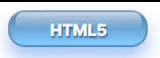
hover 했을 때 active 된 것처럼 착시 일으키도록 position : relative된 원본에서 hover할 때 1px 내려줌