![[2021/12/30]국비지원 CSS3 10-(2) transition, transition3d](https://img1.daumcdn.net/thumb/R750x0/?scode=mtistory2&fname=https%3A%2F%2Fblog.kakaocdn.net%2Fdna%2FcHso5d%2Fbtrr5Uftcn6%2FAAAAAAAAAAAAAAAAAAAAAMjoWH7IsQQPwxNMz83Ry915xlUqnZgIez6vXpL6VmS3%2Fimg.gif%3Fcredential%3DyqXZFxpELC7KVnFOS48ylbz2pIh7yKj8%26expires%3D1767193199%26allow_ip%3D%26allow_referer%3D%26signature%3DiONQSQLgUTMClh4g0ux4Bbfc2n0%253D)
★★★★★ 브라우저 식별 접두사가 필요한 속성 ★★★★★
- transition : animation property, duration, function, duration delay
- animation property
- all
- background
- color
- height
- width
- transform
- duration : start to end. /s, /ms
- function : animate type, timing etc
- linear : 일정 속도
- ease : 서서히 가속 후 급감속
- ease-in : 최속 후 감속
- ease-in-out : 처음 0속, 중간 최속, 서서히 감속
- cubic bezier : 속도값 직접 입력
- duration delay : /s, /ms 시간이 지난 뒤에 동작
- animation property
transition
<!DOCTYPE html>
<html lang="en">
<head>
    <meta charset="UTF-8">
    <meta http-equiv="X-UA-Compatible" content="IE=edge">
    <meta name="viewport" content="width=device-width, initial-scale=1.0">
    <title>css3:transition</title>
    <style type="text/css">
        .box{width:100px;height:100px;background:yellow;transition: all 1s ease 0s;}
        /* transition:원본에 */
        .box:hover{width:200px;height:200px;border-radius:100px;background:green;transform:rotate(180deg);}
        /* property-모든 속성 또는 일부 속성에 애니메이션 적용 (all, background, color, height, width, transform) */
        /* duration-시작해서 끝날떄까지 시간, 초단위 지정 */
        /* timingfunction-ease, linear 길이증가, ease-in 가속, ease-out 감속, ease-in-out,cubic-beizier 베이저 곡선 등 */
            /* linear 일정 간격 움직임*/
            /* ease 처음 서서히 가속 후 마지막 급감속*/
            /* ease-in 처음 천천히 시작 마지막 가속*/
            /* ease-out 처음 최속 마지막 감속*/
            /* ease-in-out 처음 0속 중간 최속 마지막 서서히 감속*/
            /* cubic beizier 직접 속도값 입력*/
        /* delay-시간 지난만큼 작동 -webkit-tansition-delay:0.5s; */
        .timing_fun>div{float:left;width:100px;height:50px;margin: 5px 10px;padding: 5px;border-radius:5px;
                        color: #fff;background-color:#006aff;text-align: center;font-weight:bold;}
        .timing_fun>div.ease{transition:height 3s ease 0s;}
        .timing_fun>div.linear{transition:height 3s linear 0s;}
        .timing_fun>div.ease-in{transition:height 3s ease-in 0s;}
        .timing_fun>div.ease-out{transition:height 3s ease-out 0s;}
        .timing_fun>div.ease-in-out{transition:height 3s ease-in-out 0s;}
        .timing_fun:hover>div{height:400px;}
        /* matthewlein.com/ceaser */
        .red{width:100px;height:50px;background-color:red;margin:100px;transform: translateX(0);
            transition:transform 3s cubic-bezier(0.500, 0.250, 0.500, 0.750) 0s;}
        .red:hover{transform:translateX(500px);}
        .blue{width:100px;height:50px;background-color:blue;margin:100px;
            transition:width 2s linear 0s;}
        .blue:hover{width:1000px;}
        .green{width:100px;height:50px;background-color:green;margin:100px;
               transition:all 3s ease 0s;}
        .green:hover{opacity:0.1;}
    </style>
</head>
<body>
    <div class="box"></div>
    <div class="red"></div>
    <div class="blue"></div>
    <div class="green"></div>
    <div class="timing_fun">
        <div class="ease">ease</div>
        <div class="linear">linear</div>
        <div class="ease-in">ease-in</div>
        <div class="ease-out">ease-out</div>
        <div class="ease-in-out">ease-in-out</div>
    </div>
</body>
</html>
결과물
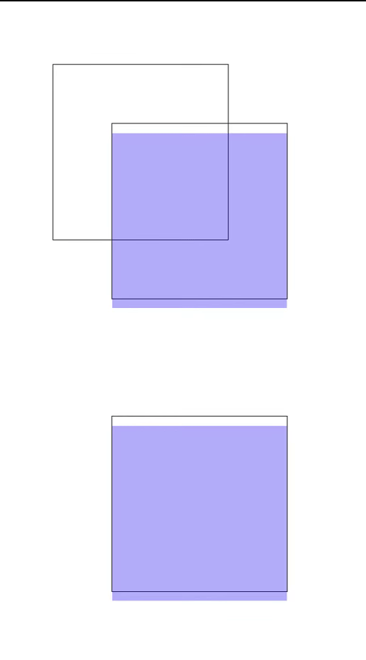
- transition3d : x, y, z
- perspective : z축을 이용한 원근감
<!DOCTYPE html>
<html lang="en">
<head>
    <meta charset="UTF-8">
    <meta http-equiv="X-UA-Compatible" content="IE=edge">
    <meta name="viewport" content="width=device-width, initial-scale=1.0">
    <title>Document</title>
    <style type="text/css">
        div{width:300px;height:300px;margin:100px;border:1px solid #333;float:left;perspective: 700px;}
        div>p{width:100%;height:100%;background:blue;opacity:0.3;transition:all 1s ease 0s;}
        div:first-child:hover>p{transform:rotateX(90deg);transform-origin: center top;}
        div:last-child:hover>p{transform:rotateY(90deg);transform-origin: center left;}
    </style>
</head>
<body>
    <div>
        <div><p></p></div>
        <div><p></p></div>
    </div>
</body>
</html>
결과물