![[2022/01/03]국비지원 CSS3 12 animation](https://img1.daumcdn.net/thumb/R750x0/?scode=mtistory2&fname=https%3A%2F%2Fblog.kakaocdn.net%2Fdna%2FbaGqcf%2FbtrsaSuv5Ll%2FAAAAAAAAAAAAAAAAAAAAAC6zGxbb22pqfUUrG_FAhXYobLUB0BoK_xmylmTwYR8R%2Fimg.gif%3Fcredential%3DyqXZFxpELC7KVnFOS48ylbz2pIh7yKj8%26expires%3D1764514799%26allow_ip%3D%26allow_referer%3D%26signature%3DHic36Qz6951Az70yGuoVScRkJz4%253D)
animation : name duration timing-function delay interation-count direction fill-mode
play-state steps
- name : 모션 이름
- duration : /s, /ms
- timing-function : 모션 중 가속도
- delay : 지연시간
- interation-count : 반복횟수
- 0% ~ 100%
- infinite
- direction : 방향
- normal
- alternate
- revers
- fill-mode : 시작 전 후 효과
- forwards
- backwards
- both
- none
- play-state : 실행 상태
- paused
- play
- steps : frame 수
입력 방식 ex
        @keyframes ani {
            0%{left: 0;border:20px solid red;}/* 0% = from 시작점 css*/
            50%{top:50px;border:20px solid blue;}
            100%{left:1000px;border:20px solid yellow;}/* 100% = to 끝점 css*/
        }
animation
<!DOCTYPE html>
<html lang="en">
<head>
    <meta charset="UTF-8">
    <meta http-equiv="X-UA-Compatible" content="IE=edge">
    <meta name="viewport" content="width=device-width, initial-scale=1.0">
    <title>CSS3 Animation</title>
    <style type="text/css">
        body{margin:0;padding:0;background:url(ruler.jpg) no-repeat 0 0;}
        div{position:relative;width:100px;height:100px;border-radius: 50%;border:2px solid black;
            background:url(f1.png) no-repeat 0 0;
            animation:ani 10s linear 0s infinite alternate forwards;}
            /* animation:name duration timing-fungtion delay interation-count direction fill-mode play-state steps; */
            /* animation:모션이름 모션초단위, 모션 중 가속도 지연시간 반복횟수(0%~100%,infinite) 방향지정(NORMAL/ALTERNATE/REVERS)
                        시작 전, 끝 효과(forwards, backwards, both, none) 실행상태(paused) 동작지정(10) */
        @keyframes ani {
            0%{left: 0;border:20px solid red;}/* 0% = from 시작점 css*/
            50%{top:50px;border:20px solid blue;}
            100%{left:1000px;border:20px solid yellow;}/* 100% = to 끝점 css*/
        }

    </style>
</head>
<body>
    <div></div>
</body>
</html>
결과물
animation clock - ss
<!DOCTYPE html>
<html lang="en">
<head>
    <meta charset="UTF-8">
    <meta http-equiv="X-UA-Compatible" content="IE=edge">
    <meta name="viewport" content="width=device-width, initial-scale=1.0">
    <title>animation_시계</title>
    <style type="text/css">
        div{width:10px;height:300px;background:blue;margin:100px auto;
            animation: ani 60s linear 3s infinite normal;}
        @keyframes ani {
            0%{transform: rotate(0deg);transform-origin: center bottom;}
            100%{transform:rotate(360deg); transform-origin:50% 100%;}
        }
    </style>
</head>
<body>
    <div></div>
</body>
</html>
결과물
과제1 animation clock - h/m/s
<!DOCTYPE html>
<html lang="en">
<head>
    <meta charset="UTF-8">
    <meta http-equiv="X-UA-Compatible" content="IE=edge">
    <meta name="viewport" content="width=device-width, initial-scale=1.0">
    <title>Document</title>
    <style type="text/css">
        .clock{position:relative; width:500px;margin:100px 300px;}/* 수정 */
        .hh{position:absolute;top:100px;left:0;/* 수정 */
            width:10px;height:200px;background:red;
            animation: ani 43200s linear 0s infinite normal;}
        .mm{position:absolute;top:50px;left:0;/* 수정 */
            width:10px;height:250px;background:green;
            animation: ani 3600s linear 0s infinite normal;}
        .ss{position:absolute;top:0;left:0;/* 수정 */
            width:10px;height:300px;background:blue;
            animation: ani 60s linear 0s infinite normal;}
        @keyframes ani {
            0%{transform: rotate(0deg);transform-origin: center bottom;}
            100%{transform:rotate(360deg); transform-origin:50% 100%;}
        }
    </style>
</head>
<body>
    <div class="clock"><!-- 수정 -->
        <div class="hh"></div>
        <div class="mm"></div>
        <div class="ss"></div>
    </div>
</body>
</html>
결과물
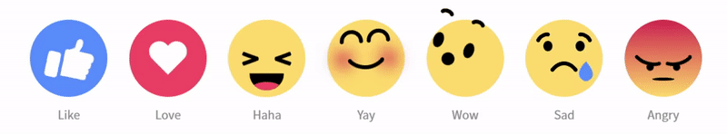
facebook emoji html
<!DOCTYPE html>
<html lang="en">
<head>
    <meta charset="UTF-8">
    <meta http-equiv="X-UA-Compatible" content="IE=edge">
    <meta name="viewport" content="width=device-width, initial-scale=1.0">
    <title>animation4_facebook emoji</title>
    <link href="css/emoji.css">
</head>
<body>
    <div class="emoji   emoji_like"><!-- class 2개 -->
        <div class="emoji_hand">
            <div class="emoji_thumb"></div>
        </div>
    </div>
    <div class="emoji   emoji_love">
        <div class="emoji_heart"></div>
        </div>
    </div>
    <div class="emoji   emoji_haha">
        <div class="emoji_face">
            <div class="emoji_eyes"></div>
            <div class="emoji_mouth">
                <div class="emoji_tongue"></div>
            </div>
        </div>
    </div>
    <div class="emoji   emoji_yay">
        <div class="emoji_face">
            <div class="emoji_eyebrows"></div>
            <div class="emoji_mouth"></div>
        </div>
    </div>
    <div class="emoji   emoji_wow">
        <div class="emoji_face">
            <div class="emoji_eyebrows"></div>
            <div class="emoji_eyes"></div>
            <div class="emoji_mouth"></div>
        </div>
    </div>
    <div class="emoji   emoji_sad">
        <div class="emoji_face">
            <div class="emoji_eyebrows"></div>
            <div class="emoji_eyes"></div>
            <div class="emoji_mouth"></div>
        </div>
    </div>
    <div class="emoji   emoji_angry">
            <div class="emoji_eyebrows"></div>
            <div class="emoji_eyes"></div>
            <div class="emoji_mouth"></div>
    </div>
</body>
</html>
facebook emoji css
        body{text-align: center;margin: 80px auto 0;}
        .emoji{position:relative;display:inline-block;width:120px;height:120px;border-radius: 50%;margin:15px 15px 40px;background: #ffda6a;}
        .emoji::after{content:"Emoji";position:absolute;bottom:-40px;left:calc(50% - 30px);width:60px;font-size:18px;color:#8a8a8a;}
        /* position:absolute 중앙 위치 */
        /* left:calc(50% - 가로1/2px) top:calc(50% - 세로1/2px) */
        /* left:50% top:50% margin-left:가로1/2px margin-top:세로1/2px */
        /* left:50% top:50% transform:translate3d(-50% -50% 0) */

        .emoji_like{background: #548dff;}
        .emoji_like::after{content:"Like";}
        .emoji_like .emoji_hand{position:absolute;left:25px;bottom:30px;width:20px;height:40px;background:#fff;border-radius:5px;
                                animation: hands_up 2s linear 0s infinite;}
        .emoji_like .emoji_hand::before{content:"";position:absolute;left:25px;bottom:5px;width:40px;height:10px;background: #fff;
                                        border-radius: 2px 10px 10px 2px;box-shadow: 1px -9px 0 1px #fff, 2px -19px 0 2px #fff,3px -29px 0 3px #fff;}
        .emoji_like .emoji_hand .emoji_thumb{position:absolute;right:-25px;top:-25px;;border-bottom:21px solid #fff;border-left:20px solid transparent;
                                            transform:rotate(5deg);transform-origin:0 100%;
                                            animation: thumbs_up 2s linear 0s infinite;}
        .emoji_like .emoji_hand .emoji_thumb:before{content:"";position:absolute;left:-9.6px;top:-8.5px;width:10px;height:12px;background:#fff;
                                                    border-radius: 50% 50% 0 0;box-shadow: -1px 4px 0 -1px #fff;transform:rotate(-14deg);transform-origin: 100% 100%;}
        @keyframes hands_up{
            25%{transform:rotate(15deg);}
            50%{transform:rotate(-15deg) translateY(-10px);}
            75%, 100%{transform:rotate(0deg);}
        }
        @keyframes thumbs_up{
            25%{transform:rotate(20deg);}
            50%,100%{transform:rotate(0deg);}
        }

        .emoji_love{background:#f55064;}
        .emoji_love::after{content:"Love"}
        .emoji_love .emoji_heart{position:absolute;top:50%;left:50%;margin-left:-40px;margin-top:-40px;
                                width:80px;height:80px;/* border:1px solid #000; */
                                animation: beat 1s linear infinite alternate;}
        @keyframes beat{
            25%{transform:scale(1.1);}
            75%{transform:scale(0.6);}
        }
        .emoji_love .emoji_heart::before, .emoji_heart::after{content:"";position:absolute;left:50%;top:50%;margin-left:-20px;margin-top:-32px;
                                                            width:40px;height:64px;border-radius: 20px 20px 0 0;background: #fff;}
        .emoji_love .emoji_heart::before{transform:translateX(20px) rotate(-45deg); transform-origin:0 100%;}
        .emoji_love .emoji_heart::after{transform:translateX(-20px) rotate(45deg);transform-origin: 100% 100%;}


        .emoji_haha .emoji_face,
        .emoji_yay .emoji_face,
        .emoji_wow .emoji_face,
        .emoji_sad .emoji_face{position:absolute;width:100%;height:inherit;}

        .emoji_haha:after{content:"Haha"}
        .emoji_haha .emoji_face{/* border:1px solid red; */
                                animation:haha 2s linear infinite normal;}
        @keyframes haha {
            10%{transform:translateY(25px);}
            20%{transform:translateY(15px);}
            30%{transform:translateY(25px);}
            40%{transform:translateY(25px);}
            50%{transform:translateY(15px);}
            60%{transform:translateY(25px);}
            70%{transform:translateY(0px);}
            80%{transform:translateY(-10px);}
            90%{transform:translateY(0px);}
            100%{transform:translateY(-10px);}
        }
        .emoji_haha .emoji_eyes{position:absolute;left:50%;top:35px;margin-left:-13px;width:26px;height:6px;border-radius:2px;/* background:#fff; */
                                            box-shadow:-25px 5px 0 0 #000,25px -5px 0 0 #000;transform:rotate(20deg);}
        .emoji_haha .emoji_eyes::after{content:"";position:absolute;left:0;top:0;width:26px;height:6px;border-radius:2px;
                                            box-shadow:-25px -5px 0 0 #000,25px 5px 0 0 #000;transform:rotate(-40deg);}
        .emoji_haha .emoji_mouth{position:absolute;left:50%;top:50%;width:80px;height:40px;margin-left:-40px;background:#000;border-radius:0 0 40px 40px;
                                animation:haha_mouth 2s linear infinite normal;overflow:hidden;}
        @keyframes haha_mouth{
            10%{transform:scale(0.6);top:45%;}
            20%{transform:scale(0.8);top:45%;}
            30%{transform:scale(0.6);top:45%;}
            40%{transform:scale(0.8);top:45%;}
            50%{transform:scale(0.6);top:50%;}
            60%{transform:scale(1);top:50%;}
            70%{transform:scale(1.2);top:50%;}
            80%{transform:scale(1);top:50%;}
            90%{transform:scale(1.1);top:50%;}
        }
        .emoji_haha .emoji_tongue{position:absolute;left:50%;bottom:-10px;width:70px;height:30px;margin-left:-35px;background:#f55064;border-radius:50%;}

        .emoji_yay::after{content: "Yay";}
        .emoji_yay .emoji_face{animation:yay 1s linear infinite alternate;}
        @keyframes yay{
            25%{transform:rotate(15deg);}
            75%{transform:rotate(-15deg);}
        }

        .emoji_yay .emoji_eyebrows,
        .emoji_wow .emoji_eyebrows,
        .emoji_sad .emoji_eyebrows,
        .emoji_yay .emoji_mouth,
        .emoji_sad .emoji_mouth,
        .emoji_angry .emoji_eyebrows{position:absolute;left:calc(50% - 3px);}

        .emoji_yay .emoji_eyebrows,
        .emoji_yay .emoji_mouth,
        .emoji_wow .emoji_eyebrows,
        .emoji_sad .emoji_eyebrows,
        .emoji_sad .emoji_mouth,
        .emoji_angry .emoji_eyebrows{width:6px;height:6px;border-radius:50%;}


        .emoji_yay .emoji_eyebrows{top:30px;/* background:#fff; */
                                    box-shadow:-6px 0 0 0 #000,-36px 0 0 0 #000, 6px 0 0 0 #000, 36px 0 0 0 #000;}
        .emoji_yay .emoji_eyebrows::before,.emoji_yay .emoji_eyebrows::after{content:"";position:absolute;left:calc(50% - 18px);bottom:3px;width:36px;height:18px;
                                                                            border-radius:60px 60px 0 0;border: 6px solid #000;border-bottom:0;box-sizing:border-box;}
        .emoji_yay .emoji_eyebrows::before{margin-left:21px;}
        .emoji_yay .emoji_eyebrows::after{margin-left:-21px;}
        .emoji_yay .emoji_mouth{top:60px;/* background:red; */box-shadow:-25px 0 0 0 #000, 25px 0 0 0 #000, -35px -2px 25px 10px #d5234c, 35px -2px 25px 10px #d5234c;}
        .emoji_yay .emoji_mouth::before{content:"";position:absolute;left:calc(50% - 39.1px);top:-63.5px;width:78px;height:80px;border-radius: 50%;
                                        border:6px solid #000;box-sizing: border-box;border-left-color: transparent;border-top-color: transparent;
                                        border-right-color: transparent;}

        .emoji_wow::after{content:"Wow";}
        .emoji_wow .emoji_face{animation: wow 3s linear 0s infinite;}
        @keyframes wow {
            15%,25%{transform: rotate(20deg) translateX(-25px);}
            45%,65%{transform: rotate(-20deg) translateX(25px);}
            75%,100%{transform: rotate(0deg) translateX(0);}
        }
        .emoji_wow .emoji_eyebrows{/* background:#fff; */
                                    box-shadow:-18px 0 0 0 #000,-33px 0 0 0 #000, 18px 0 0 0 #000, 33px 0 0 0 #000;
                                    animation:wow_brow 3s linear infinite;}
        @keyframes wow_brow {
            15%,65%{transform:translateY(0px);}
            75%,100%,0%{transform:translateY(25px);}
        }
        .emoji_wow .emoji_eyebrows::before,.emoji_wow .emoji_eyebrows::after{content:"";position:absolute;left:calc(50% - 12.1px);top:-2.8px;
                                                                            width:24.5px;height:20px;border-radius:50%;border: 6px solid #000;
                                                                            box-sizing:border-box;border-left-color: transparent;
                                                                            border-bottom-color: transparent;border-right-color: transparent;}
        .emoji_wow .emoji_eyebrows::before{margin-left:25.5px;}
        .emoji_wow .emoji_eyebrows::after{margin-left:-25.5px;}

        .emoji_wow .emoji_eyes,
        .emoji_sad .emoji_eyes{position:absolute;left:calc(50% - 7px);}

        .emoji_wow .emoji_eyes{top:35px;width:16px;height:24px;border-radius:50%;
                                /* background:red; */
                                box-shadow:-25px 0 0 0 #000, 25px 0 0 0 #000;}
        .emoji_wow .emoji_mouth{position:absolute;left:calc(50% - 15px);top:50%;width:30px;height:45px;border-radius:50%;background:#000;
                                animation:wow_mouth 3s linear 0s infinite;}
        @keyframes wow_mouth {
           10%,30%{width:20px;height:20px;left:calc(50% - 10px);}
           50%,70%{width:30px;height:40px;left:calc(50% - 15px);}
           75%,100%{height:50px;}
        }

        .emoji_sad::after{content: "Sad";}
        .emoji_sad .emoji_face{animation: sad 2s ease-in infinite;}
        @keyframes sad{
            25%, 35%{top:-15px;}
            55%, 95%{top:10px;}
            100%, 0%{top:0px;}
        }
        .emoji_sad .emoji_eyebrows{top:35px;/* background:#fff; */
                                    box-shadow:-40px 9px 0 0 #000,-25px 0 0 #000,25px 0 0 #000,40px 9px 0 0 #000;}
        .emoji_sad .emoji_eyebrows::before,.emoji_sad .emoji_eyebrows::after{content:"";position:absolute;left:calc(50% - 14.5px);top:15%;
                                                                            width:28px;height:20px;border:6px solid #000;box-sizing:border-box;
                                                                            border-radius:50%;
                                                                            border-left-color: transparent;
                                                                            border-bottom-color: transparent;border-right-color: transparent;}
        .emoji_sad .emoji_eyebrows::before{margin-left:-29.9px;transform: rotate(-30deg);}
        .emoji_sad .emoji_eyebrows::after{margin-left:30.6px;transform: rotate(30deg);}
        .emoji_sad .emoji_eyes{top:40%;width:14px;height:16px;border-radius:50%;
                               box-shadow:25px 0 0 0 #000,-25px 0 0 0 #000;}
        .emoji_sad .emoji_eyes:before{content:"";position:absolute;top:70%;width:12px;height:12px;margin-left:6px;
                                        border-radius:0 100% 40% 50% / 0 50% 40% 100%;transform-origin: 0% 0%;
                                        /* border-radius:top-left-x top-right-x bottom-right-x bottom-left-x /
                                                        top-left-y top-right-y bottom-right-y bottom-left-y */
                                        background:#548dff;
                                        animation: tear_drop 2s ease-in infinite;}
        @keyframes tear_drop {
            0%,100%{display:block;left:35px;top:15px;transform:rotate(45deg) scale(0);}
            25%{display:block;left:35px;transform:rotate(45deg) scale(2);}
            49.9%{display:block;left:35px;top:65px;transform:rotate(45deg) scale(0);}
            50%{display:block;left:-35px;top:15px;transform:rotate(45deg) scale(0);}
            75%{display:block;left:-35px;transform:rotate(45deg) scale(2);}
            99.9%{display:block;left:-35px;top:65px;transform:rotate(45deg) scale(0);}
        }

        .emoji_sad .emoji_mouth{top:90px;box-shadow:-18px 0 0 0 #000,18px 0 0 0 #000;}
        .emoji_sad .emoji_mouth::after{content:"";position:absolute;left:calc(50% - 31px);top:-10px;width:50px;height:80px;
                                        border-radius:50%;border:6px solid #000;border-left-color: transparent;
                                        border-bottom-color: transparent;border-right-color: transparent;}


        .emoji_angry{background:linear-gradient(to bottom, #d5234c -10%,#ffda6a 100%);background-size: 100%;}
        .emoji_angry::after{content: "Angry";}
        .emoji_angry .emoji_face{position:absolute;width:100%;height:inherit;}
        .emoji_angry .emoji_eyebrows{top:55px;box-shadow:-44px 0px 0 0 #000,-7px 11px 0 0 #000,7px 11px 0 0 #000,44px 0px 0 0 #000;animation:angry_face 2s ease-in infinite;}
        .emoji_angry .emoji_eyebrows::before,.emoji_angry .emoji_eyebrows::after{content: "";position:absolute;left: calc(50% - 25px);top:-15px;
                                                                                width:42px;height:20px;border:6px solid #000;border-radius:50%;
                                                                                border-left-color: transparent;border-top-color: transparent;
                                                                                border-right-color: transparent;}
        .emoji_angry .emoji_eyebrows::before{margin-left:-25.5px;transform:rotate(17deg);}
        .emoji_angry .emoji_eyebrows::after{margin-left:21.5px;transform:rotate(-17deg);}
        .emoji_angry .emoji_eyes{position:absolute;left:calc(50% - 6px);top:65px;width:12px;height:12px;border-radius:50%;
                                box-shadow: -22px 3px 0 0 #000,22px 3px 0 0 #000;animation:angry_face 2s ease-in infinite;}
        @keyframes angry_face {
            35%, 60% {transform: translateX(0) translateY(0px) scale(0.9);}
            40%, 50% {transform: translateX(-10px) translateY(0px) scale(0.9);}
            45%, 55% {transform: translateX(10px) translateY(0px) scale(0.9);}
        }
        .emoji_angry .emoji_mouth{position:absolute;left:calc(50% - 18px);bottom:15px;width:36px;height:18px;background:#000;border-radius:50%;
                                animation: angry_mouth 2s ease-in infinite,angry_face 2s ease-in infinite;}
        @keyframes angry_mouth {
	    25%, 50% {height: 5px; bottom: 25px;}
        }
원래는 html 안에 그냥 한 내용인데
포스팅에는 css가 너무 길어서
임의로 구분해서 올림
결과물
과제2 윙크하는 라이언 ( hover 걸라고 했는데 ani 입힘 )
<!DOCTYPE html>
<html lang="en">
<head>
    <meta charset="UTF-8">
    <meta http-equiv="X-UA-Compatible" content="IE=edge">
    <meta name="viewport" content="width=device-width, initial-scale=1.0">
    <title>카카오 라이언</title>
    <style type="text/css">
        /* hover 왼쪽 눈 눈썹 15도 올라감; 오른쪽 눈썹 15도, 눈 감김 */
        body{margin:0 auto 0;}
        .ryan{position:relative;width:300px;height:300px;background:#313654;margin:50px 50px 0;}
        .ryan .ears{position:absolute;left:15% ;top:45px;}
        .ryan .ears::before, .ryan .ears::after{content:"";position:absolute;width:60px;height:60px;
                                                background:#d5972a;border:6px solid #000;
                                                border-radius:50%;box-sizing: border-box;}
        .ryan .ears::before{margin-left:150px;}
        .ryan .ears::after{margin-right:-150px;}
        .ryan .face{position:absolute;left:calc(50% - 125px);top:calc(50% - 100px);width:250px;height:220px;
                    background:#d5972a;border:6px solid #000;border-radius:50%;box-sizing: border-box;}
        .ryan .eyebrows{position:absolute;left:50%;top:55px;box-sizing: border-box;}
        .ryan .eyebrows::before,.ryan .eyebrows::after{content:"";position:absolute;width:46px;height:8px;
                                                       background:#000;border-radius: 5px 5px 5px 5px;}
        .ryan .eyebrows::before{left:calc(50% - 80px);top:5px;animation:eyebrow_left 1s ease-in infinite}
        @keyframes eyebrow_left{
            0%{transform:translateY(5px);}
            100%{transform:translateY(0px);}
        }
        .ryan .eyebrows::after{left:calc(50% + 30px);top:5px;animation: eyebrow_right 1s ease-in infinite;}
        @keyframes eyebrow_right {
            0%{transform:rotate(-15deg);}
            100%{transform:rotate(0deg);}
        }
        .ryan .eyes{position:absolute;left:calc(50% - 60px);top:90px;width:16px;height:16px;
                    background:#000;border-radius: 50%; box-sizing: border-box; }
        .ryan .eyes::after{content:"";position:absolute;left:calc(50% + 90px);top:0px;width:16px;height:16px;
                            background:#000; border-radius: 50%;transform-origin:center;
                            animation:eye_right 1s ease-in infinite;}
        @keyframes eye_right {
            0%{transform:scaleY(0.1);}
        }
        .ryan .nose{position:absolute;z-index:10;left:calc(50% - 9px);top:110px;width:18px;
                    height:18px;background:#000; border-radius: 40% 40% 50% 50%;box-sizing: border-box;}
        .ryan .mouth{position:absolute;width:100%;left:calc(50% - 38px);top:115px;width:43px;height:40px;background:#fff;
                     box-sizing: border-box; border:6px solid #000;border-radius: 50% 50%;}
        .ryan .mouth::before,.ryan .mouth::after{content:"";position:absolute;}
        .ryan .mouth::before{left:calc(50% + 10px);top:-5px;width: 43px;height:40px;background: #fff;
                             border:6px solid #000; border-radius: 50%;box-sizing: border-box;}
        .ryan .mouth::after{left:12px;top:4px;width:23px;height:20px;border-radius:50%;background:#fff;
                            box-shadow:15px 0px 0 0 #fff;}
    </style>
</head>
<body>
    <div class="ryan">
        <div class="ears"></div>
        <div class="face">
            <div class="eyebrows"></div>
            <div class="eyes"></div>
            <div class="nose"></div>
            <div class="mouth"></div>
        </div>
    </div>
</body>
</html>
결과물