![[2022/02/04]국비지원 CSS3 13 @mediaquery](https://img1.daumcdn.net/thumb/R750x0/?scode=mtistory2&fname=https%3A%2F%2Fblog.kakaocdn.net%2Fdna%2FcHY3ee%2FbtrsFt2HnT0%2FAAAAAAAAAAAAAAAAAAAAAI6MSIkFh_GNq7TsgAaEv3HSJW-QI4yNgXBV1KRDwr43%2Fimg.jpg%3Fcredential%3DyqXZFxpELC7KVnFOS48ylbz2pIh7yKj8%26expires%3D1764514799%26allow_ip%3D%26allow_referer%3D%26signature%3DbCNcu1VGdZkXnLfg0xg%252B7wrdE%252Fg%253D)
flex, grid는 안 하고 끝나버린 css3
그 부분은 독학해야 하고 사실 나 스스로는 @mediaquery도 다시 해 봐야 한다.
더보기
이 날은 컨디션이 달마다 찾아오는 대자연현상으로 심한 난조를 보여,
파일은 같은 팀원께서 제공해주신 부분에 해당하기 때문임
압도적 감사!!!!
css3에서 반응형 웹에 필요한 것
1. flex
2. @mediaquery
- 공통점
- 하나만 이용한 반응형 웹 가능
- 사용 비추 단위
- px : 사이즈 고정 단위라서
- 사용 추천 단위 ( v = viewport )
- 해상도 : vw, vh, vmin, vmax, %
- font사이즈 : rem, em
단점은, flex와 @mediaquery를 둘 다 쓸 수는 있어도 javascript까지 적용하게 되면
같은 해상도일지라도 mediaquery와 javascript의 인식범위가 달라져버린다는 것..
그래서 mediaquery를 빼고 flex와 javascript만 가지고 노는 것도 사실은 괜찮은 방법이라고 본다.
※ 뒤에 query가 붙는다고 해서 jquery 소속은 아니다.
이 날 사용한 원본 이미지
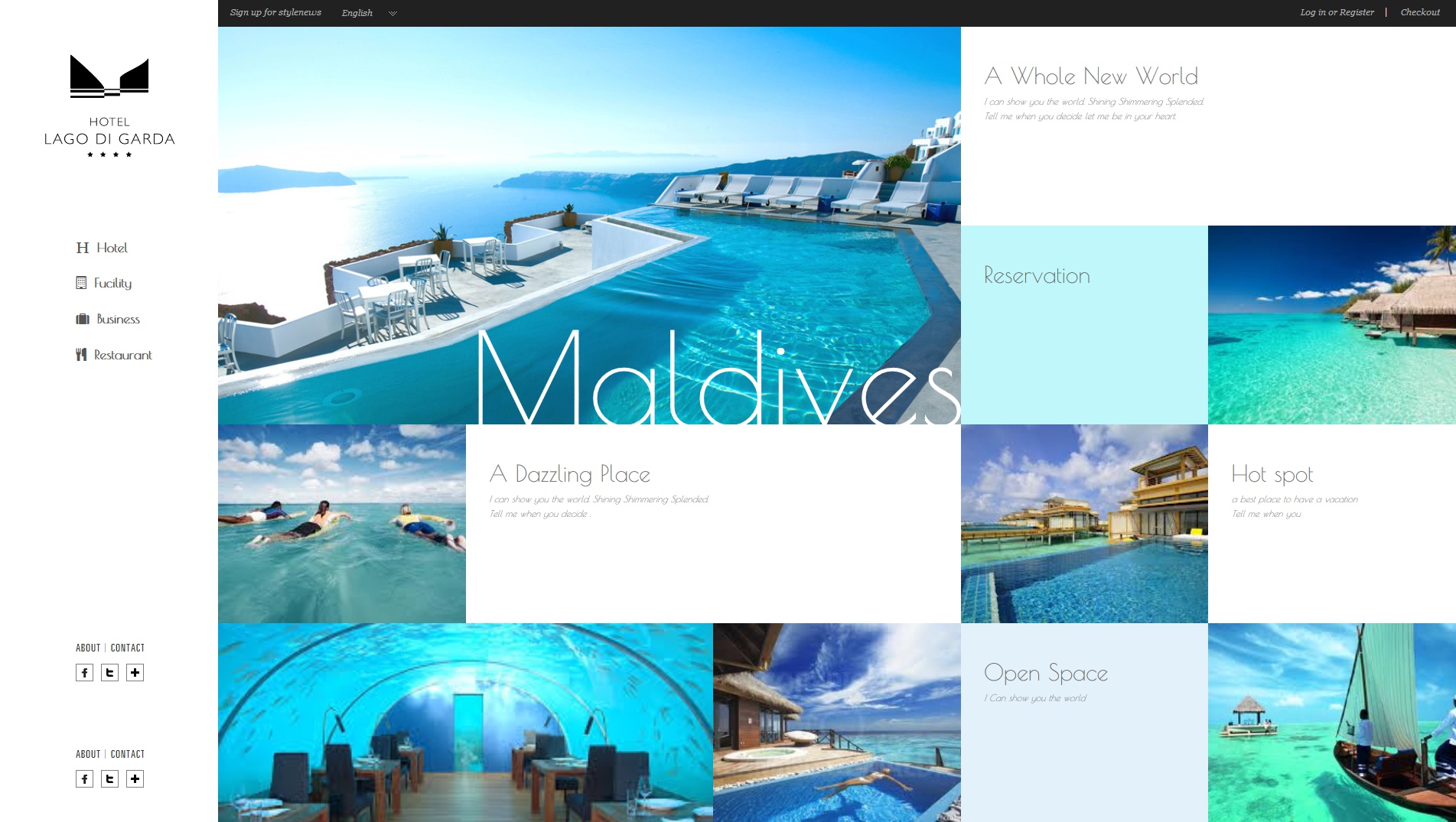
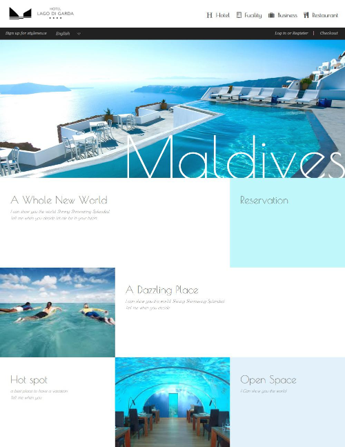
절반 사이즈
브라우저 Width 최소 출력 시 사이즈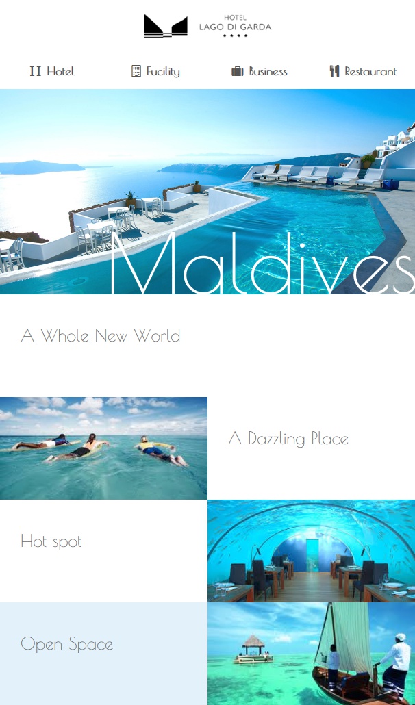
작업된 html (애정하는 팀원님께 감사)
<!DOCTYPE html>
<html lang="en">
<head>
  <meta charset="UTF-8">
  <meta http-equiv="X-UA-Compatible" content="IE=edge">
  <meta name="viewport" content="width=device-width, initial-scale=1.0">
  <title>예제1 Flex</title>
  <link rel="stylesheet" href="css/main.css">
</head>
<body>
  <header>
    <h1>HOTEL LAGO DI GRADA</h1>
    <nav class="gnb">
      <ul>
        <li><a href="#"><i class="fas fa-hotel"></i>Hotel</a></li>
        <li><a href="#"><i class="far fa-building"></i>Facility</a></li>
        <li><a href="#"><i class="fas fa-suitcase"></i>Business</a></li>
        <li><a href="#"><i class="fas fa-utensils"></i>Restaurant</a></li>
      </ul>
    </nav>
    <dl class="topMenu">
      <dt class="blind">탑메뉴</dt>
      <dd><a href="#"><img src="img/sns1.png" alt="about"/></a></dd>
      <dd><a href="#"><img src="img/sns2.png" alt="contact"/></a></dd>
      <dd><a href="#"><img src="img/sns3.png" alt="facebook"/></a></dd>
      <dd><a href="#"><img src="img/sns4.png" alt="twitter"/></a></dd>
      <dd><a href="#"><img src="img/sns5.png" alt="etc"/></a></dd>
    </dl>
  </header>
  <nav class="lnb">
    <ul>
      <li><a href="#"><img src="img/util1.png" alt="Sign up for stylenews"/></a></li>
      <li><a href="#"><img src="img/util2.png" alt="English"/></a></li>
      <li><a href="#"><img src="img/util3.png" alt="Log in or Resister"/></a></li>
      <li><a href="#"><img src="img/util4.png" alt="Checkout"/></a></li>
    </ul>
  </nav>
  <section>
    <article>
      <div class="bg bg1">
        <span>Maldives</span>
      </div>
    </article>
    <article>
      <div class="txt">
        <i fas fa-arrow-right></i>
        <p>
          <strong>A Whole New World</strong><br>
          <em>I can show you the world. Shining Shimmering Splended.<br>
            Tell me when you decide let me be in your heart.</em>
        </p>
      </div>
    </article>
    <article>
      <div class="txt">
        <i class="fas fa-spin fa-sync-alt"></i>
        <p><strong>Reservation</strong></p>
      </div>
    </article>
    <article>
      <div class="bg bg2">
        <span>Suite</span>
      </div>
    </article>
    <article>
      <div class="bg bg3">
        <span>Surf</span>
      </div>
    </article>
    <article>
      <div class="txt">
        <i class="fas fa-arrow-right"></i>
        <p>
          <strong>A Dazzling Place</strong><br>
          <em>I can show you the world. Shining Shimmering Splended.<br>
            Tell me when you decide .</em>
        </p>
      </div>
    </article>
    <article>
      <div class="bg bg4">
        <span>Sauna</span>
      </div>
    </article>
    <article>
      <div class="txt">
        <i class="fas fa-arrow-right"></i>
        <p>
          <strong>Hot spot</strong><br>
          <em>a best place to have a vacation <br>
            Tell me when you</em>
        </p>
      </div>
    </article>
    <article>
      <div class="bg bg5">
        <span>Diner</span>
      </div>
    </article>
    <article>
      <div class="bg bg6">
        <span>Spa</span>
      </div>
    </article>
    <article>
      <div class="txt">
        <i class="fas fa-arrow-right"></i>
        <p>
          <strong>Open Space</strong><br>
          <em>I Can show you the world</em>
        </p>
      </div>
    </article>
    <article>
      <div class="bg bg7">
        <span>Tour</span>
      </div>
    </article>
  </section>
  <footer></footer>
</body>
</html>
작업된 css3
@import url('https://fonts.googleapis.com/css2?family=Poiret+One&display=swap');
@import url(../fontawesome-free-5.15.4-web/css/all.css);
/* reset */
* { margin: 0; padding: 0; /* box-sizing: border-box; */ }
ol, ul { list-style: none; }
a { text-decoration: none; color: #555; }
img { border: 0; }
.blind { position: absolute; left: 0; top: 0; width: 0; height: 0; font-size: 0; line-height: 0; text-indent: -9999px; overflow: hidden; }
body { font-size: 12px; line-height: 1.6; font-family: "Poiret One", cursive; color: #555; }

/* 레이아웃 */
body > header { position: fixed; left: 0; top: 0; width: 15%; height: 100%; background: rgb(255, 255, 255); }
.lnb { position: relative; width: 85%; height: 35px; margin-left: 15%; background: #212121; }

/* 반응형웹
1.부모는 무조건 100% 기준이다.
section 가로값 100% 기준
section안에 article이 다섯개있으니까 - 한개 당(한칸 당) 20%*/
body > section { width: 85%; margin-left: 15%; }
body > section > article { float: left; height: 260px; animation: scale 1s ease 0s 1; }
@keyframes scale {
 0% { transform: scale(0); }
100% { transform: scale(1); }
 }
body > section > article:nth-of-type(1) { width: 60%; height: 520px; background: #ddd; }
body > section > article:nth-of-type(2) { width: 40%; background: #ccc; }
body > section > article:nth-of-type(3) { width: 20%; background: #bbb; }
body > section > article:nth-of-type(4) { width: 20%; background: #aaa; }
body > section > article:nth-of-type(5) { width: 20%; background: #999; }
body > section > article:nth-of-type(6) { width: 40%; background: #888; }
body > section > article:nth-of-type(7) { width: 20%; background: #777; }
body > section > article:nth-of-type(8) { width: 20%; background: #666; }
body > section > article:nth-of-type(9) { width: 40%; background: #555; }
body > section > article:nth-of-type(10) { width: 20%; background: #444; }
body > section > article:nth-of-type(11) { width: 20%; background: #333; }
body > section > article:nth-of-type(12) { width: 20%; background: #222; }
h1 { position: absolute; left: 50%; margin-left: -90px; top: 70px; width: 180px; height: 136px; background: url(../img/logo1.png) no-repeat 0 0; background-size: contain; text-indent: -9999px; overflow: hidden; }
 /* 너비나 높이 중 큰 값을 배경이미지가 삽입되는 요소에 맞춘다
 auto: 이미지의 크기가 그대로 표시
 cover: 너비나 높이 중 작은값을 배경이미지가 삽입되는 요소에 맞춘다.(풀스크린 화면의 배경이미지는 이걸 주로 사용) */
.gnb { position: absolute; top: 300px; right: 57px; }
.gnb a { display: block; padding: 8px 30px; font-size: 17px; font-weight: bold; color: #555; line-height: 1.8; }
.gnb a:hover { color: skyblue; }
.gnb a i { margin-right: 10px; }
.topMenu { position: absolute; right: 50%; bottom: 50px; width: 90px; height: 47px; margin-right: -45px; }
.topMenu dd { float: left; }

/* lnb */
.lnb li:nth-child(1) { position: absolute; left: 10px; top: 5px; }
.lnb li:nth-child(2) { position: absolute; left: 150px; top: 5px; }
.lnb li:nth-child(3) { position: absolute; right: 90px; top: 5px; }
.lnb li:nth-child(4) { position: absolute; right: 10px; top: 5px; }

/* section */
article > div { position: relative; width: 100%; height: 100%; cursor: pointer; overflow: hidden; }

/* 배경이미지 삽입 */
article .bg1 { background: url(../img/pic1.jpg) no-repeat 50% 50%; }
article .bg2 { background: url(../img/pic2.jpg) no-repeat 50% 50%; }
article .bg3 { background: url(../img/pic3.jpg) no-repeat 50% 50%; }
article .bg4 { background: url(../img/pic4.jpg) no-repeat 50% 50%; }
article .bg5 { background: url(../img/pic5.jpg) no-repeat 50% 50%; }
article .bg6 { background: url(../img/pic6.jpg) no-repeat 50% 50%; }
article .bg7 { background: url(../img/pic7.jpg) no-repeat 50% 50%; }
article .bg { background-size: cover; }
article div.bg span { position: absolute; right: 20px; bottom: 0; font-size: 60px; color: #fff; transform: scale(10); opacity: 0; transition: all 0.6s linear 0s; }
article div.bg:hover span { transform: scale(1); opacity: 1; }
article div.bg1 span { position: absolute; right: -6px; bottom: -76px; font-size: 170px; transform: scale(1); opacity: 1; transition: all 0.5s linear 0s; }
 /* transform 과 opacity는 위에 전체 bg로 지정한거를 바꿔주기위해 */
article div.bg1:hover span { transform: rotateY(180deg); color: #222; }

/* 텍스트박스 */
article div.txt { color: #666; background: #fff; padding: 40px 30px; box-sizing: border-box; }
article:nth-of-type(3) div.txt { background: #bff7fa; }
article:nth-of-type(11) div.txt { background: #e3f1fb; }
article div.txt strong { font-size: 30px; font-weight: normal; }
article:hover div.txt { background: #6ce2fb; color: #fff; }
article .txt i { position: absolute; right: -200px; bottom: -70px; opacity: 0; font-size: 300px; color: #b2effc; transition: all 0.3s linear 0s; }
article:hover .txt i { right: 0; opacity: 0.5; }

/* 미디어쿼리 */
@media screen and (min-width: 1280px) and (max-width: 1599px) { /* 1번째 1280~1599 */
 /* 레이아웃 */
body > header { position: relative; left: 0; top: 0; width: 100%; height: 80px; background: rgb(255, 255, 255); }
.lnb { position: relative; width: 100%; height: 35px; margin-left: 0%; background: #212121; }
body > section { width: 100%; margin-left: 0%; }
/* header */
h1 { position: absolute; left: 20px; margin-left: 0; top: 20px; width: 200px; height: 40px; background: url(../img/logo2.png) no-repeat 0 0; background-size: contain; text-indent: -9999px; overflow: hidden; }
.gnb { position: absolute; top: 20px; right: 200px; }
.gnb li { float: left; }
.topMenu { position: absolute; right: 80px; bottom: 20px; width: 90px; height: 47px; margin-right: 0; }
 }
 @media screen and (min-width: 1024px) and (max-width: 1279px) {/* 2번째 1024~1279 */
/* 레이아웃 */
body > header {position: relative;left: 0;top: 0;width: 100%;height: 80px;background: rgb(255, 255, 255); }

.lnb {position: relative;width: 100%;height: 35px;margin-left: 0%;background: #212121; }
body > section {width: 100%;margin-left: 0%; }
/* header */

h1 {position: absolute;left: 20px;margin-left: 0;top: 20px;width: 200px;height: 40px;background: url(../img/logo2.png) no-repeat 0 0;background-size: contain;text-indent: -9999px;overflow: hidden; }
.gnb {position: absolute;top: 20px;right: 30px; }
.gnb li {float: left; }
.topMenu {display: none; }

body > section > article:nth-of-type(1) {width: 75%;height: 520px; }
body > section > article:nth-of-type(2) {width: 25%; }
body > section > article:nth-of-type(3) {width: 25%; }
body > section > article:nth-of-type(4) {width: 25%; }
body > section > article:nth-of-type(5) {width: 25%; }
body > section > article:nth-of-type(6) {width: 50%; }
body > section > article:nth-of-type(7) {width: 50%; }
body > section > article:nth-of-type(8) {width: 25%; }
body > section > article:nth-of-type(9) {width: 25%; }
body > section > article:nth-of-type(10) {width: 50%;background: #444; }
body > section > article:nth-of-type(11) {width: 25%; }
body > section > article:nth-of-type(12) {width: 25%; }
 }
@media screen and (min-width: 780px) and (max-width: 1023px) {/* 3번째 780~1023 */
body > header {position: relative;left: 0;top: 0;width: 100%;height: 80px;background: rgb(255, 255, 255); }

.lnb {position: relative;width: 100%;height: 35px;margin-left: 0%;background: #212121; }
body > section {width: 100%;margin-left: 0%; }
/* header */

h1 {position: absolute;left: 20px;margin-left: 0;top: 20px;width: 200px;height: 40px;background: url(../img/logo2.png) no-repeat 0 0;background-size: contain;text-indent: -9999px;overflow: hidden; }
.gnb {position: absolute;top: 20px;right: 10px; }
.gnb li {float: left; }
.gnb a {padding: 8px 10px; }
.topMenu {display: none; }

body > section > article:nth-of-type(1) {width: 100%;height: 400px; }
body > section > article:nth-of-type(2) {width: 66.666%; }
body > section > article:nth-of-type(3) {width: 33.333%; }
body > section > article:nth-of-type(4) {display: none; }
body > section > article:nth-of-type(5) {width: 33.333%; }
body > section > article:nth-of-type(6) {width: 66.666%; }
body > section > article:nth-of-type(7) {display: none; }
body > section > article:nth-of-type(8) {width: 33.333%; }
body > section > article:nth-of-type(9) {width: 33.333%; }
body > section > article:nth-of-type(10) {display: none; }
body > section > article:nth-of-type(11) {width: 33.333%; }
body > section > article:nth-of-type(12) {display: none; }
 }
@media screen and (min-width: 640px) and (max-width: 779px) {/* 4번째 640~779*/
body > header {position: relative;left: 0;top: 0;width: 100%;height: 80px;background: rgb(255, 255, 255); }

.lnb {position: relative;width: 100%;height: 35px;margin-left: 0%;background: #212121; }
body > section {width: 100%;margin-left: 0%; }
/* header */

h1 {position: absolute;left: 20px;margin-left: 0;top: 20px;width: 200px;height: 40px;background: url(../img/logo2.png) no-repeat 0 0;background-size: contain;text-indent: -9999px;overflow: hidden; }
.gnb {position: absolute;top: 20px;right: 10px; }
.gnb li {float: left; }
.gnb a {padding: 8px 10px; }
.topMenu {display: none; }

body > section > article:nth-of-type(1) {width: 100%;height: 400px; }
body > section > article:nth-of-type(2) {width: 100%; }
body > section > article:nth-of-type(3) {display: none; }
body > section > article:nth-of-type(4) {display: none; }
body > section > article:nth-of-type(5) {width: 50%; }
body > section > article:nth-of-type(6) {width: 50%; }
body > section > article:nth-of-type(7) {display: none; }
body > section > article:nth-of-type(8) {width: 50%; }
body > section > article:nth-of-type(9) {width: 50%; }
body > section > article:nth-of-type(10) {display: none; }
body > section > article:nth-of-type(11) {width: 50%; }
body > section > article:nth-of-type(12) {width: 50%; }
 }
@media screen and (min-width: 501px) and (max-width: 639px) {/* 5번째 501~639 */
body > header { position: relative;left: 0;top: 0;width: 100%;height: 130px;background: rgb(255, 255, 255); }
.lnb {/* position: relative;width: 100%;height: 35px;margin-left: 0%;background: #212121; */ display: none; }
body > section {width: 100%;margin-left: 0%; }
/* header */
h1 { position: absolute;left: 50%;margin-left: -100px;/* 가로크기의 -1/2 */top: 20px;width: 200px;height: 40px;background: url(../img/logo2.png) no-repeat 0 0;background-size: contain;text-indent: -9999px;overflow: hidden; }
.gnb { position: absolute;top: 80px;right: 0;width: 100%; }
.gnb ul { width: 100%; }
.gnb ul:after { content: "";display: block;clear: both; }
.gnb ul li { float: left;width: 25%;text-align: center; }
.gnb a { padding: 8px 10px; }
.topMenu { display: none; }

/* 텍스트박스 */
article div.txt strong {font-size: 25px; }
article div.txt em {display: none; }
body > section > article {height: 150px; }
/* 높이가 바뀌니까 그부분만 가져와서 바꿔주는 */
body > section > article:nth-of-type(1) {width: 100%;height: 400px; }
body > section > article:nth-of-type(2) {width: 100%; }
body > section > article:nth-of-type(3) {display: none; }
body > section > article:nth-of-type(4) {display: none; }
body > section > article:nth-of-type(5) {width: 50%; }
body > section > article:nth-of-type(6) {width: 50%; }
body > section > article:nth-of-type(7) {display: none; }
body > section > article:nth-of-type(8) {width: 50%; }
body > section > article:nth-of-type(9) {width: 50%; }
body > section > article:nth-of-type(10) {display: none; }
body > section > article:nth-of-type(11) {width: 50%; }
body > section > article:nth-of-type(12) {width: 50%; }
 }
@media screen and (max-width: 500px) {/* 6번째 0~500 */
body > header {z-index: 40;position: fixed;left: 0;top: 0;width: 100%;height: 100%;background: rgb(255, 255, 255, 0); }

.lnb {/* position: relative;width: 100%;height: 35px;margin-left: 0%;background: #212121; */ display: none; }
body > section {width: 100%;margin-left: 0%; }
/* header */
h1 {position: absolute;left: 50%;margin-left: -70px;/* 가로크기의 -1/2 */
top: 20px;width: 140px;height: 136px;background: url(../img/logo1.png) no-repeat 0 0;background-size: contain;text-indent: -9999px;overflow: hidden; }
.gnb {position: absolute;top: 140px;right: 50%;margin-right: -125px;width: 250px; }
.gnb a {padding: 8px 30px;font-size: 17px;font-weight: bold;background-color: #000;color: #fff;line-height: 1.8;opacity: 0.5;border-radius: 10px;margin: 8px 0;transition: all 0.5s ease 0s; }
.gnb a:hover {color: skyblue;opacity: 1;transform: scale(1.1); }
.topMenu {display: none; }

body > section > article {display: none; }
/* 높이가 바뀌니까 그부분만 가져와서 바꿔주는 */
body > section > article:nth-of-type(1) {display: block;position: fixed;width: 100%;height: 100%; }
article div.bg1 span {display: none; }
 }
결과물